Your app’s success is contingent on a combination of factors, but I feel as you probably do as well, that the overall mobile user experience (UX) tops them all. The apps that stand out in the market are those that deliver great UX.
Now, there are a countless number of elements that when applied in an optimum combination make your app’s UX one that users don’t forget.
When it comes down to designing for mobile UX, sticking to best practices for your particular industry is a solid way to go. And applying ones that your users are already familiar with, will empower you to incorporate the most effective approaches to guide app user behavior.
Without a concrete understanding of the psychology and philosophical underpinnings of the practices you choose, you’ll most likely miss the boat and this will lead to a frustrating and friction-filled user experience.Below are various strategies used to achieve UX stardom and why they should be employed. Following them in every aspect of mobile UX design will help you avoid mistakes
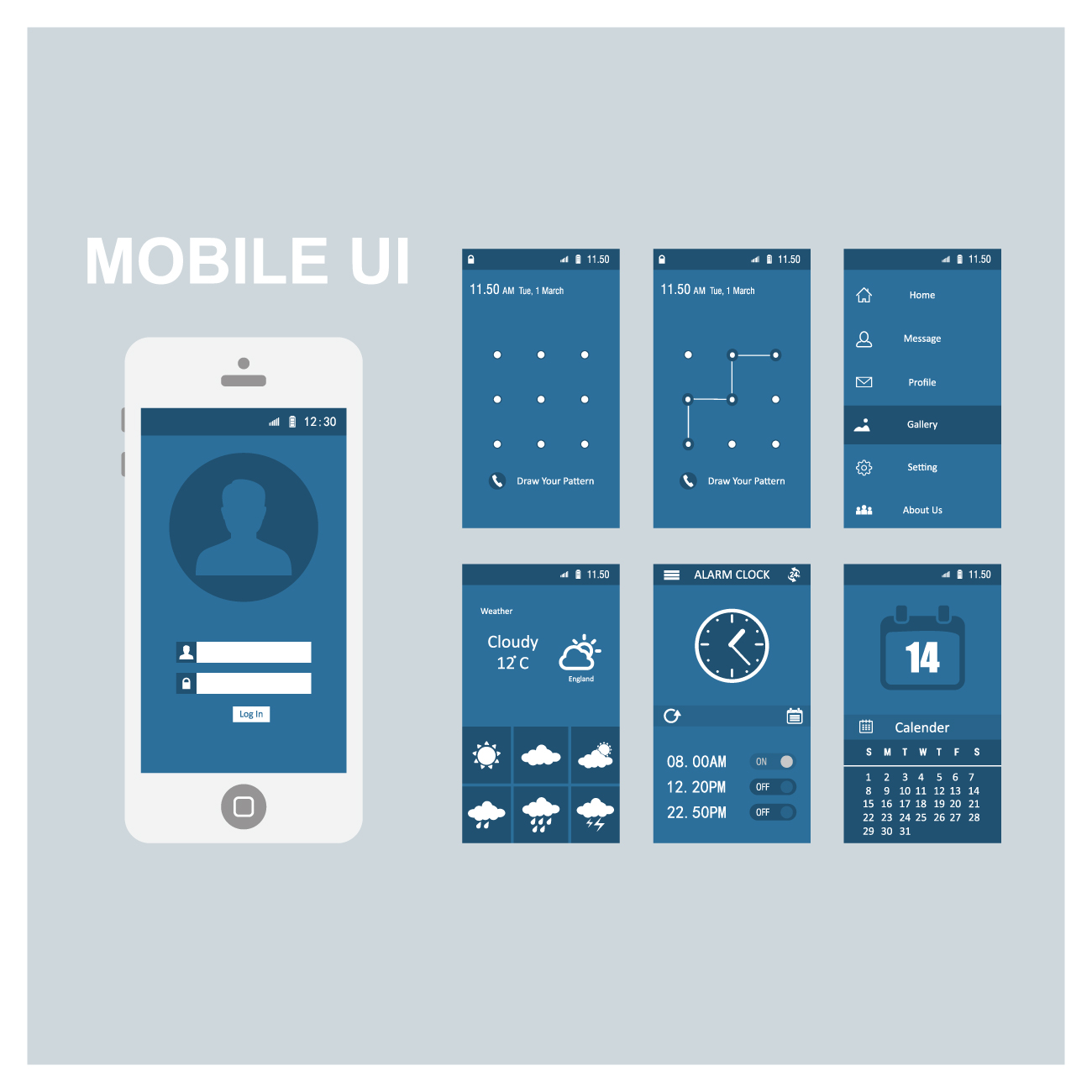
A huge factor in making your app’s mobile UX shine is its UI. As I’m sure you know, the elements of your app’s UI can include everything from the different size screen your target device employs to the virtual keyboard that pops up on demand.
As if reacting to the beat of a drum, the two major mobile platforms, iOS and Android are releasing updates that dramatically alter UI design that impact their respective users and how they use apps. Developers are following these changes closely and are taking advantage while developing apps that take advantage of these new features. This will keep their creations competitive in an ever shifting mobile landscape, by releasing killer apps.
From a psychological perspective the use of color has had a profound impact on such important mobile app factors as conversion rates, as certain colors instill a propensity to take action.
Color can also just as in the real world, give people certain feelings, and particular colors make people react in a certain way.The same holds true regarding the psychological aspect of conversion rate optimization. Take the colors red and green. These are known as colors that rank high for conversions when used in call-to-action (CTA) buttons. See here for some great case studies on which color converts better and why.
In China, for example, the use of bright colors in any app are a must. It doesn’t take long to discover why. The color red is used throughout Chinese websites. The color communicates happiness in China. Nothing beats a happy customer.
A growing trend over the past few years has been to use Minimal UI Design. This perspective has grown highly popular because a mobile app needs to be super functional, not just nice to look at, and can be applied to a number of different processes within the mobile app, such as in-app purchase and registration, which improves the overall mobile app UX.
The key principle of this approach is to present the user with only what they need to know. Psychologically, this is known to be a smoother way to introduce the user to your app. It also lessens the load of information that the user needs to memorize. These two principles are the guiding strategies in providing the user with an exceptional mobile user experience.
They say you only get one shot at a first impression. In the context of Mobile UX, delivering a top notch onboarding experience is the foundation for attracting and retaining users. Think of onboarding as an entry ramp to the app highway, with the different screens being the scenery along that highway.
So, what is the onboarding experience? What is its goal? The goal of onboarding is to show the value of your app to the user, by demonstrating how they can achieve what they want quickly and efficiently. There are a slew of strategies one can implement to maximize the mobile UX during this phase, while getting users to come back.
One of these strategies is the progressive onboarding. This onboarding process is interactive, providing the user with instructions as they actually use the app. If your app has an intricate workflow, multiple sections, hidden functionalities, and/or gesture-driven interactions, then progressive onboarding is the best choice.
Back in the days before mobile (remember?) desktop sites utilized various technologies to customize the screen based on past user visit preferences. They did this via the use of cookies. This type of customization migrated to mobile, but it was difficult because the vast array of screen sizes (especially with the Android platform) was quite a hassle for mobile developers.
Enter personalization, where the behavior of past visits is recorded by an app, and stored. In the age of Big Data, there are countless ways to improve the mobile UX. Say, for example, your users prefer to purchase a certain type of product for their child at the beginning of every month, a personalized app would offer them special deals on that type of product at the end of each month. With this information, an app can increase revenue by offering makers of those products the ability to provide their users with personalized recommendations.
The use of pinching, swiping and scrolling are examples of Gesturization. An app’s UI was restricted to touch in the past with minimal functionality for swiping and pinching. Now, designers are placing more emphasis on gestures in their UI designs. For example, swipe gestures now facilitate such actions as share and delete.
Additionally, it is vital to know your market and the other apps your target audience may be using, so you can employ the same types of gestures in your app. This way, you are not only optimizing your UI based on your target market’s behavior, users will feel comfortable with your app from the beginning and it will be much easier to onboard them.
Apps such Gmail and Facebook use side swiping menus to save space. Think about it. You want to make room on a table, you swipe something aside. It is the same psychology behind this type of gesturing as shown below.
Last but not least, for a final strategy, I’d say an app’s UX must be monitored from day one by utilizing app UX analytics, which will help app makers understand the why behind the key metrics and quantitative data.
Such app UX analytics tools present you with qualitative data by providing unique features, such as user recordings and touch heatmaps, which allow you to take a deep-dive into the user experience. This highlights major drawback of traditional mobile analytics, like the one Google Analytics offers, which just focus on the numbers instead of the reasons for user actions The insights gained from app UX analytics will allow you to accurately refine your app, moving one step further towards ultimate UX optimization, and that mobile pot of gold.
For example, you have identified a high drop off rate on the registration screen. This is great to know, but why is it happening? By watching the user session recording below, you noticed a user who cannot create an account with Facebook due to a technical problem as indicated by the popup message. This not only highlights why users are dropping off the registration screen but also shows a basic flaw within your app’s UX.
There are various strategies that work in providing the ultimate UX experience. Refining the mobile app’s UX is critical in maintaining that edge, and that is why I highly recommend to start monitoring your users’ behavior from day one utilizing app UX analytics.
As a company we focus on maintaining integrity and compliance in everything we do. We have explored our potentials and have successfully achieved outstanding results. The phenomenal products given by us is a result of our consistent practice in latest technologies.
3 Comments